The Good, The Bad, And The Ugly – Week 20

The Good

We’re revisiting the NZDCAD pair from a few weeks ago. 

It’s still in the bull flag, and you can see that bears have stubbornly defended the top of the flag and prevented bulls from even testing a breakout. 

NZDCAD Weekly Chart – Click to enlarge.

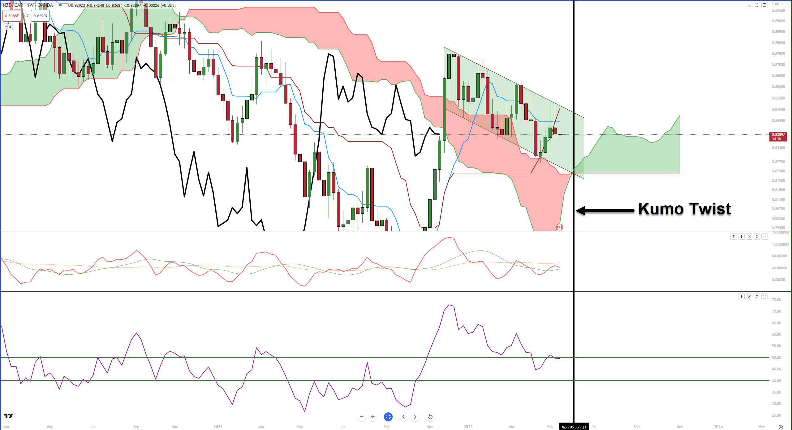
But bears shouldn’t be overconfident nor bulls overly despondent. 

The weekly RSI is in oversold territory, and the Composite Index is flattening out a good amount – imagine a coiled spring. 

From a time cycle perspective, the Kumo Twist in the week of June 5 will be very important to watch as it could be the trigger that sees NZDCAD make a major bullish or bearish move. 

But when you look at the Kiwi’s performance in the RRG, it’s not hard to see why bulls might be favored for some action here. 

The Bad

The bad here is for DXY bears and EURUSD bulls. 

The monthly DXY on the left and the monthly EURUSD on the right both share (not surprisingly) an important condition within the Ichimoku system: bad gaps. 

DXY (left) and EURUSD (right) Monthly Charts – Click to enlarge.

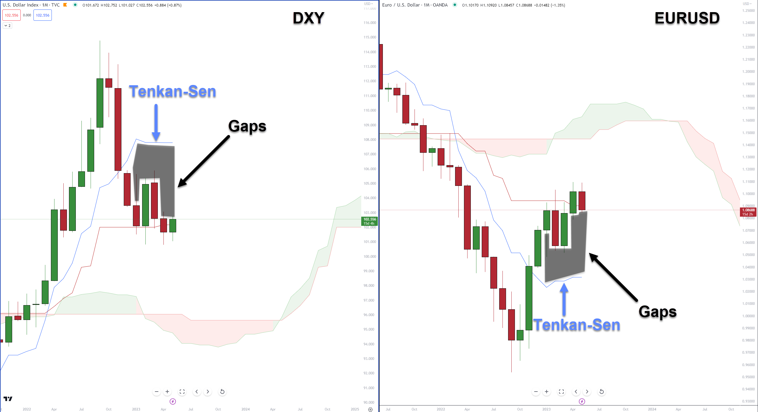
The gaps between the bodies of the candlesticks and the Tenkan-Sen are substantial and have been unresolved for five months. 

Every day these gaps exist, there is an increased chance of a mean reversion back to the Tenkan-Sen – something to watch for. 

The Ugly

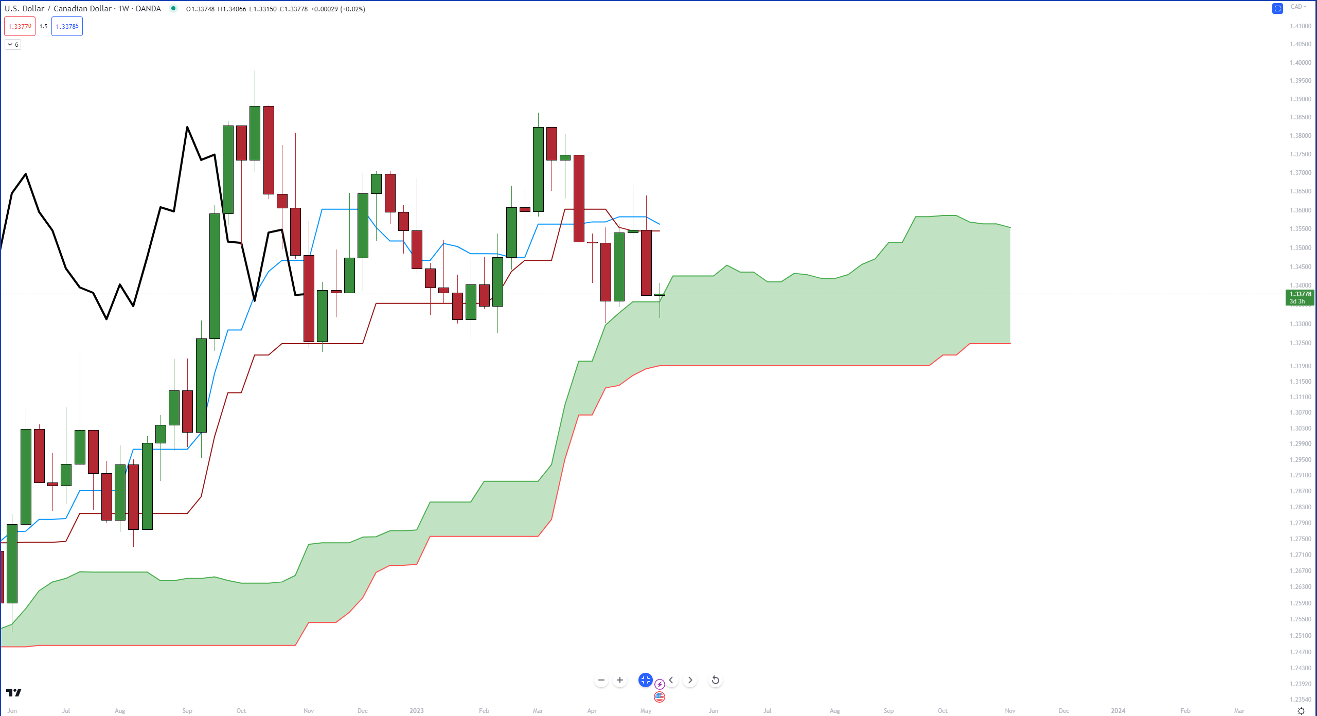
This is an update to last week’s Ugly chart – USDCAD. 

Here’s what it looked like last week:

USDCAD Week 19 Weekly Chart – Click to enlarge.

And here’s what USDCAD’s weekly chart looks like now:

USDCAD Weekly Chart – Click to enlarge.

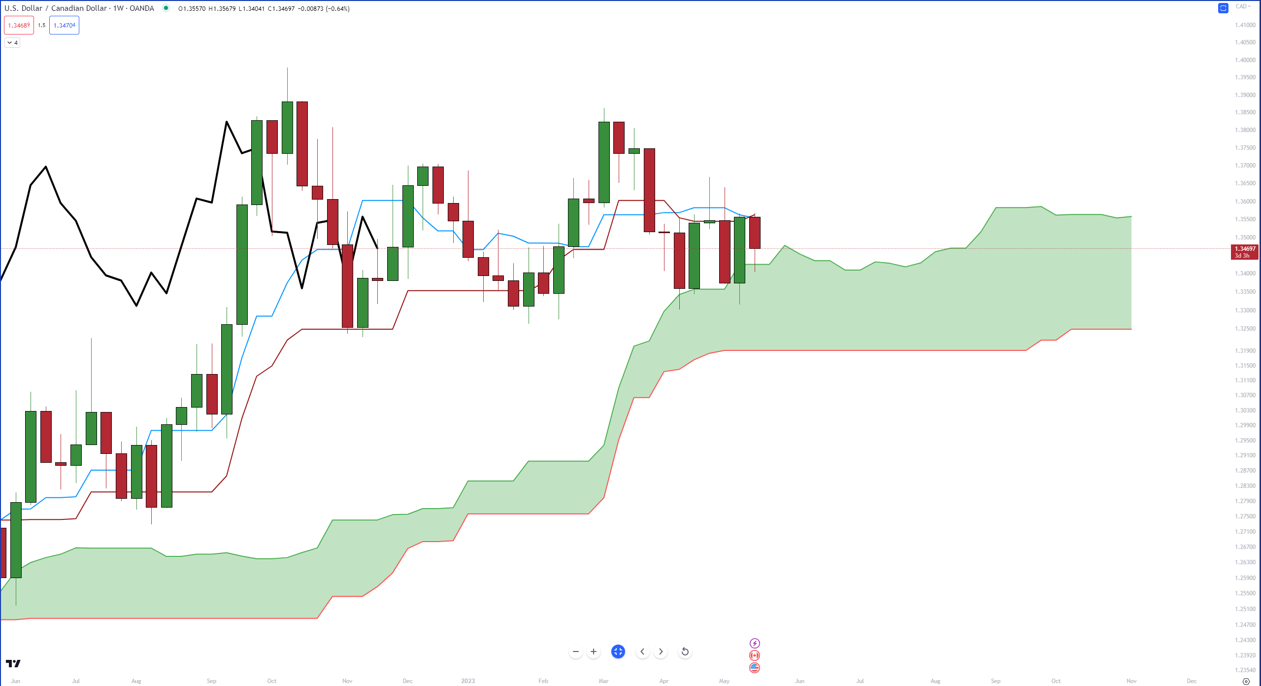
A nice bounce of the top of the Ichimoku Cloud (Senkou Span A) kept price from moving inside the Cloud, but bulls couldn’t push price above the Tenkan-Sen or Kijun-Sen. 

Currently, the Kijun-Sen and Tenkan-Sen are acting as resistance, and you’ll notice price action is ping-ponging between them and the Cloud. 

Additionally, the Chikou Span is inside the candlesticks. It’s a warning sign that congestion is likely to continue. 😖

Learn More About...

FX RRG – Week 18

Stocktwits Forex RRG

Relative Rotation Graphs (RRG) are useful visual tools to identify how an instrument or a sector performs against a benchmark. The benchmark used for the FX RRG is the U.S. Dollar Index (DXY).

Without going into the nitty-gritty details, the four colored sectors can be thought of like this, so imagine you’re in a race:

Read It

FX RRG – Week 19

Stocktwits Forex RRG

Relative Rotation Graphs (RRG) help us visualize how a currency or sector performs compared to a benchmark – in this case, the U.S. Dollar Index (DXY). Think of the four colored sectors as stages in a race:

Leading Quadrant (green) – You’re a champ! 🏆 You’re ahead of everyone else, and the crowd is cheering. But watch out; you might be overdoing it.
Weakening Quadrant (yellow) – You’re slowing down 😓 and losing your lead. Maybe you’re a bit demoralized because your biggest fan didn’t show up. You’re now in the middle of the pack.
Lagging Quadrant (red) – Disaster strikes! 😱 You’re injured, exhausted, or just made a big mistake. You’re now in last place, and it’s a sad scene.
Improving Quadrant (blue) – Time for a comeback! 💪 Your motivation returns, the music swells, and you’re picking up speed. You’re back in the middle, catching up with the leaders.

Read It

Stocktwits Top 25 FAQ

This is a quick summary of how the Stocktwits Top 25 indexes are constructed, formatted, and released each week.

First off, these indexes are purely objective exercises. We’re not subjectively picking stocks or saying if individual stocks are good or bad. Instead, we provide an updated list of the market’s best-performing stocks (year-to-date) every week. It’s a scoreboard of the market’s current trends and a way of tracking their changes over time.
 
The lists are comprised of the index’s underlying holdings. For example, the S&P 500 uses the S&P 500 stocks. The only time we adjust the list’s underlying holdings is when the asset managers running these indexes reconstitute them (usually 2x a year) and when individual stocks drop off because of a delisting, acquisition, or any other reason they might stop trading.
 
Next, we use Google Finance to pull the data in our tables automatically. The year-to-date formula calculates each stock’s return from its closing price on the last trading day of the previous year. The week-to-date formula calculates each stock’s return from last Friday’s closing price to the current Friday.
 
Once that data is pulled each week, we adjust the tables to include the top 25 stocks in each index by year-to-date performance. Then, we list which stocks made it and which fell out of the top 25 that week.
 
The “momentum meter” for the S&P 500 list is the average week-to-date performance of the list’s 25 components. And the “Top Dawg” of the week is simply the stock with the largest week-to-date gain across all three lists.
 
After all that, we manually review the entire post and deliver it to your inbox every Saturday at ~3 pm ET.
 
As of 01/20/24, we’ve added sentiment score and watcher count to our tables to provide additional context on each symbol. This data can be found on individual symbol pages.
 
This post was created on 03/03/2023 and will be updated if/when the process changes in the future.

Read It