Stocktwits Forex RRG
Relative Rotation Graphs (RRG) help us visualize how a currency or sector performs compared to a benchmark – in this case, the U.S. Dollar Index (DXY). Think of the four colored sectors as stages in a race:
- Leading Quadrant (green) – You’re a champ! 🏆 You’re ahead of everyone else, and the crowd is cheering. But watch out; you might be overdoing it.
- Weakening Quadrant (yellow) – You’re slowing down 😓 and losing your lead. Maybe you’re a bit demoralized because your biggest fan didn’t show up. You’re now in the middle of the pack.
- Lagging Quadrant (red) – Disaster strikes! 😱 You’re injured, exhausted, or just made a big mistake. You’re now in last place, and it’s a sad scene.
- Improving Quadrant (blue) – Time for a comeback! 💪 Your motivation returns, the music swells, and you’re picking up speed. You’re back in the middle, catching up with the leaders.
💡 Analyzing the RRG Examples
Example 1: Rapid Rotation
– If an FX pair moves quickly through all four quadrants, it could indicate high volatility or erratic behavior. Traders may want to be cautious or use appropriate risk management strategies in such cases.
Example 2: Stuck in the Middle
– An FX pair that remains close to the center of the RRG might be in a consolidation phase, lacking a clear trend or momentum. Traders might wait for a decisive move before entering a position.
Example 3: Consistent Leader
– If an FX pair stays in the Leading Quadrant (top right) for an extended period, it could signify a strong, sustained uptrend. Traders might consider buying opportunities or riding the trend.
Example 4: Slow Recovery
– An FX pair that gradually moves from the Lagging Quadrant (bottom left) to the Improving Quadrant (blue) and eventually to the Leading Quadrant (green) could indicate a slow but steady recovery. Traders might look for potential reversal or bottom-fishing opportunities.
Remember, RRG analysis should be used in conjunction with other technical and fundamental analysis tools to make more informed trading decisions.
Daily RRG
The gif below shows the last 10 trading days worth of movement.
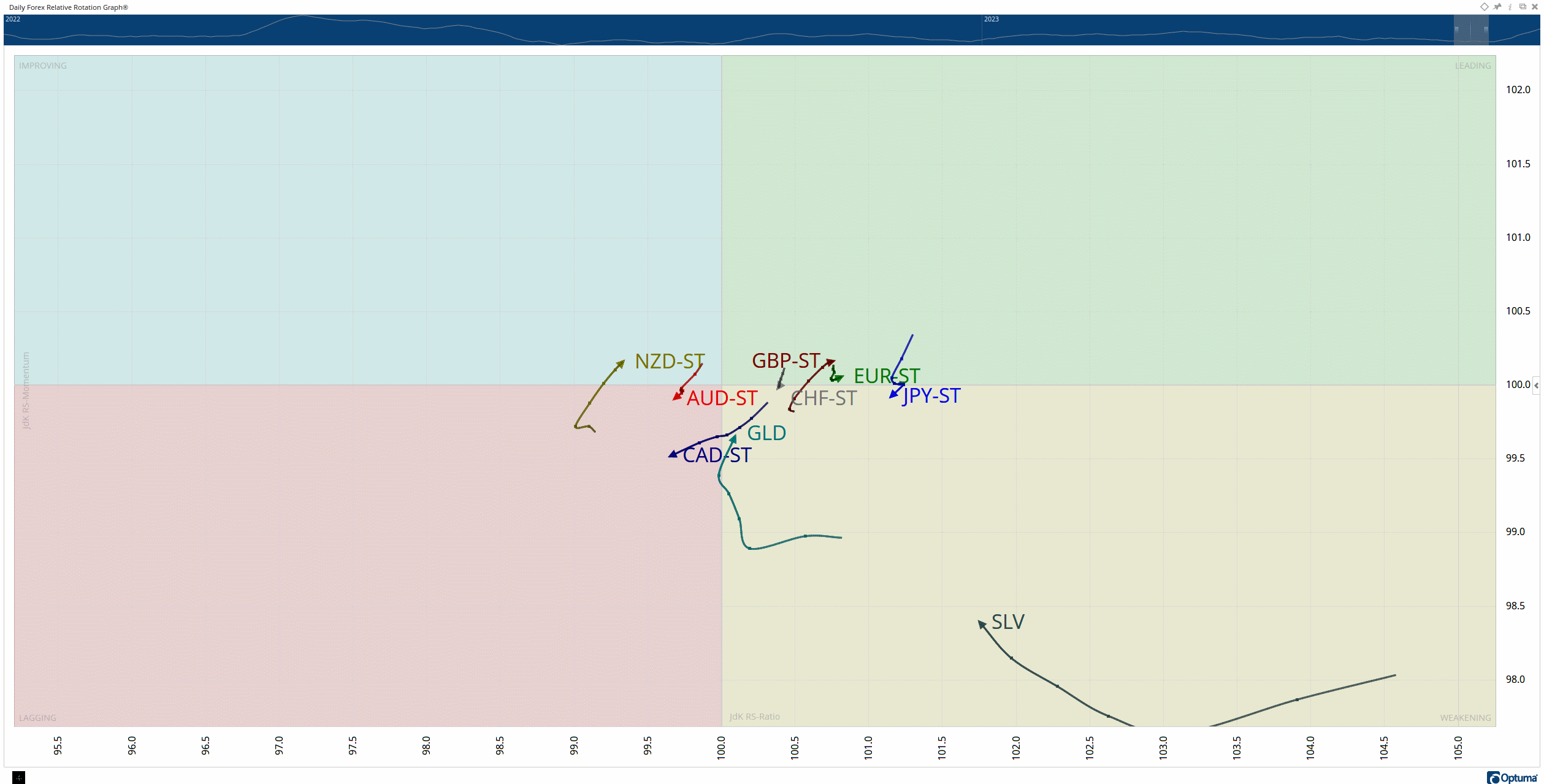
Gold, Silver, and the Kiwi are showing the strongest momentum on the daily RRG, with the Euro showing continued downside pressure and the weakest of the bunch.
Weekly RRG
The gif below shows the last 13 weeks of movement.
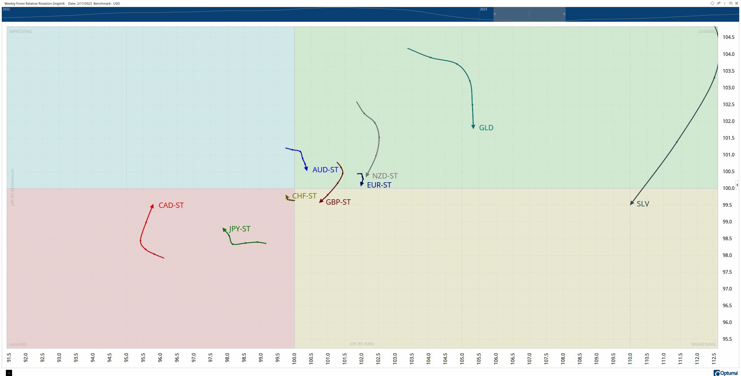
The Aussie and Kiwi are the biggest laggards and, as a result, have the best opportunity for speculators looking for risky long setups.
The Loonie and Yen look like they’re weakening with momentum slowing, while the Pound and Euro show a return into the Leading category.
And Silver is on cocaine.