This is more of a ‘sneak peak’ into something new you’ll be seeing in the Litepaper – and possibly in the crypto streams on StockTwits.
Knowing what cryptocurrencies are leading or lagging the market is important – but I also want to know what ‘sectors’ are leading and lagging. Unfortunately, many sites and services offer a juiced-up version of an Excel spreadsheet, but nothing graphical.
I’m a visual person. I was the kid who wanted pictures in the books versus just a bunch of pages with stoopud wurds.
I’ve created several custom indices for the cryptocurrency market. Those indices are Top 10, Yield Farming, Privacy, Proof-of-Work, Proof-of-Stake, Metaverse, DeFi, DEX, CEX, and Altcoins. Others will be added – I would love to hear your suggestions!
The indices are comprised of the top 10 cryptocurrencies by market cap in their category and are rebalanced monthly. I use the professional technical analysis software, Optuma, to create a Relative Rotation Graph which then displays how the indices are performing.
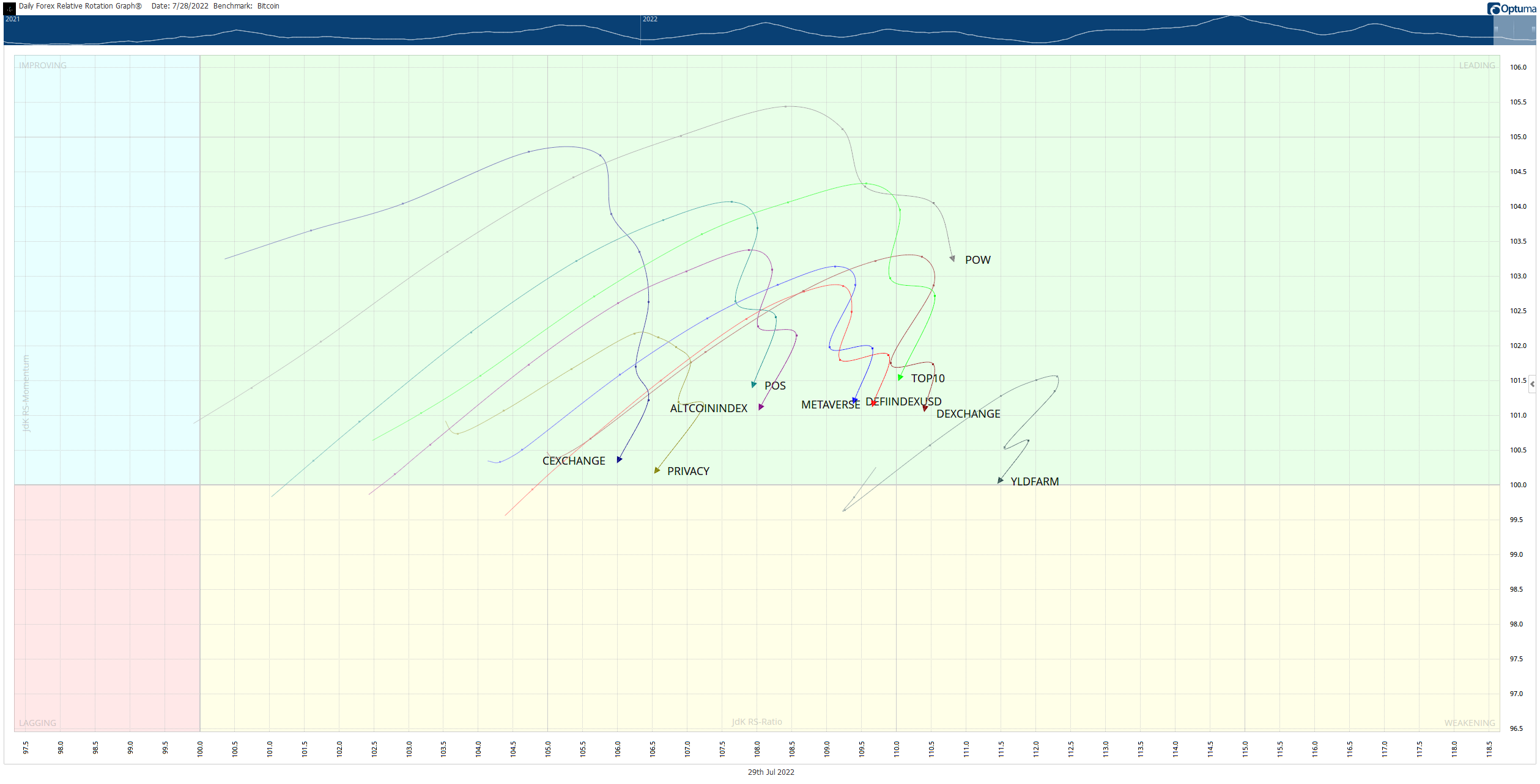
The image above won’t be the one we’ll end up using – the team of artists here at StockTwits who know how to make awesome fire-blingy-looking graphics will make it look better soon. 🎯