Have you ever wondered what percentage of people holding Bitcoin is in the red or the green? Wondering if people are still interested in crypto and Bitcoin? One of the secret weapons of cryptocurrencies is on-chain analytics. On-chain analysis gives normal people like you and me access to the same information that the bigwigs have.
It’s like having the ability to see dark pools in the stock market. Let’s take a look at some of this on-chain data now.
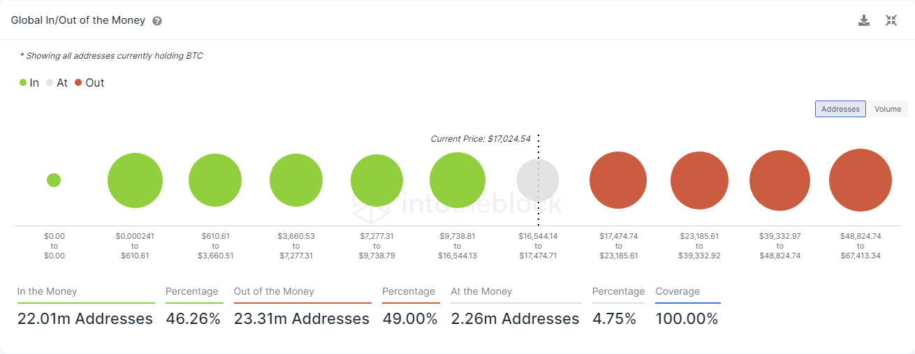
In The Money/Out Of The Money
According to IntoTheBlock’s metrics, 49% of all addresses holding BTC are out of the money. On the other hand, 46.26% are in the money. In other words, more people are in the red than sitting positive.
Wallets With 10 Or More BTC
The image below shows Bitcoin’s price action( white line) and the number of BTC addresses that have 10 or more Bitcoin (blue line).
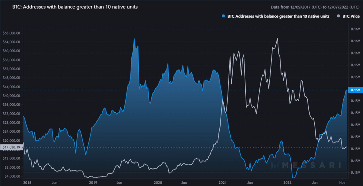
While prices have continued to decline throughout 2022, the number of wallets holding 10 or more BTC increased.
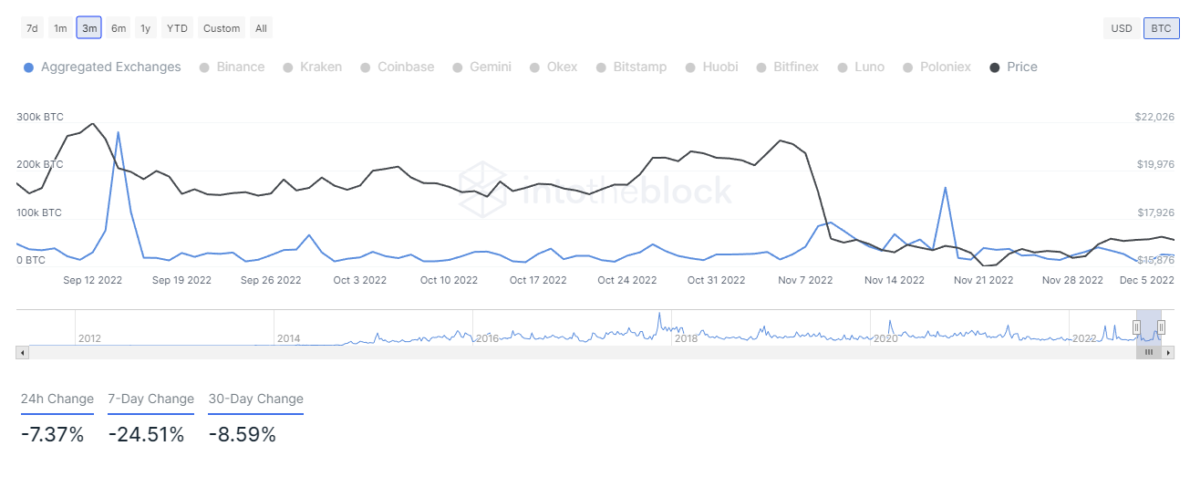
In Flows And Out Flows
When we talk about inflows, we’re talking about BTC going to an exchange.
For outflows, we’re talking about BTC moving off an exchange.
Analysts interpret the inflows of BTC as a bearish sign because transactional history shows that the BTC heading to an exchange is sold back in U.S. Dollars.
On the other hand, analysts view outflows as bullish because that means BTC is moving away from a place to be sold and (usually) into a wallet to hodl.
Notice the 7-Day and 30-Day change for inflows below:
Now compare those to the outflows chart below:
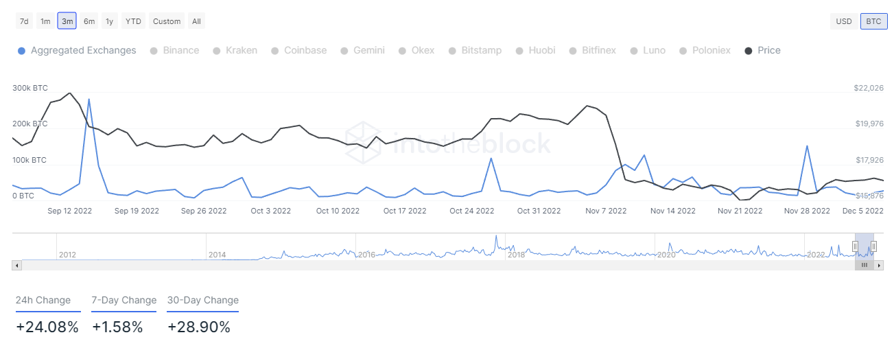
A significant difference between the drop in inflow vs. the growth in outflows.
Putting It All Together
Despite prices for Bitcoin and the broader crypto market continuing to fall, there are clear signs that individuals and bigger entities are accumulating more Bitcoin as some analysts interpret the data.
In addition, there are signs that the selling pressure has diminished somewhat. But that doesn’t mean it is finished – it just slowed down.