Technically Speaking – March 6, 2024

Let’s take a peek at some charts. 🧿

Chainlink

LINKUSD Daily Chart – Click to enlarge.

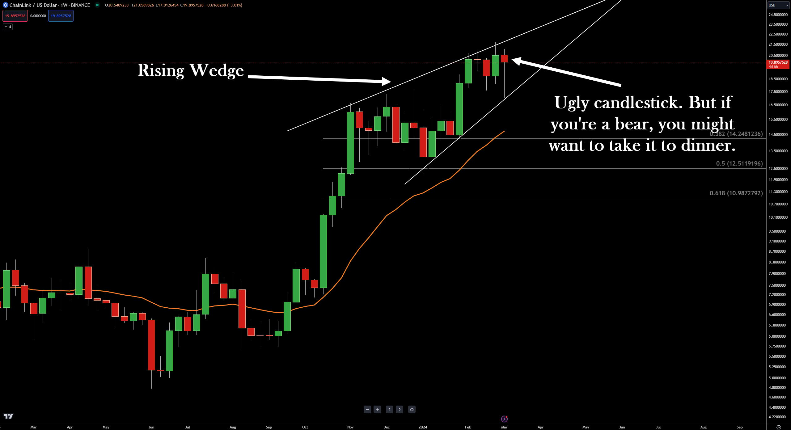
$LINK‘s weekly chart looks ugly as hell for bulls – maybe. There’s plenty of the week left, but the weekly candlestick is Ugly with a capital U. Additionally, there’s a rising wedge on the chart. 

The rising wedge is arguably the most bearish common chart pattern that exists. Butas bearish as it is, when price action fails to collapse and instead breaks out higher, the move is often Dramatic with a capital D. ✅

Tron

TRXUSD Daily Chart – Click to enlarge.

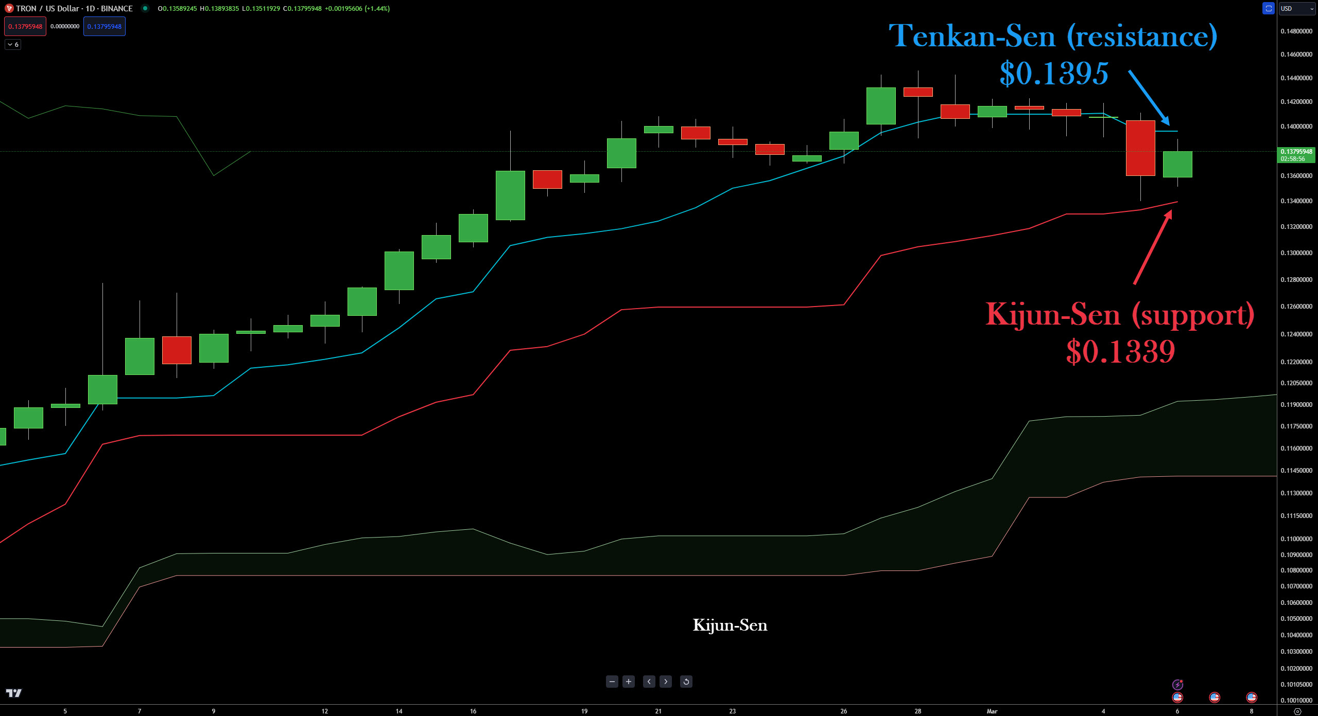
I’m switching to the Ichimoku Kinko Hyo system here for $TRX. This one is simple for bulls: they’re waiting for a re-entry or to add when the daily closes above the Tenkan-Sen, almost smack dab on top of $0.14. 

Additionally, the Composite Index (note shown) is now in a historical support zone. ☀️

Shiba Inu

SHIBUSD 1-hour Chart – Click to enlarge.

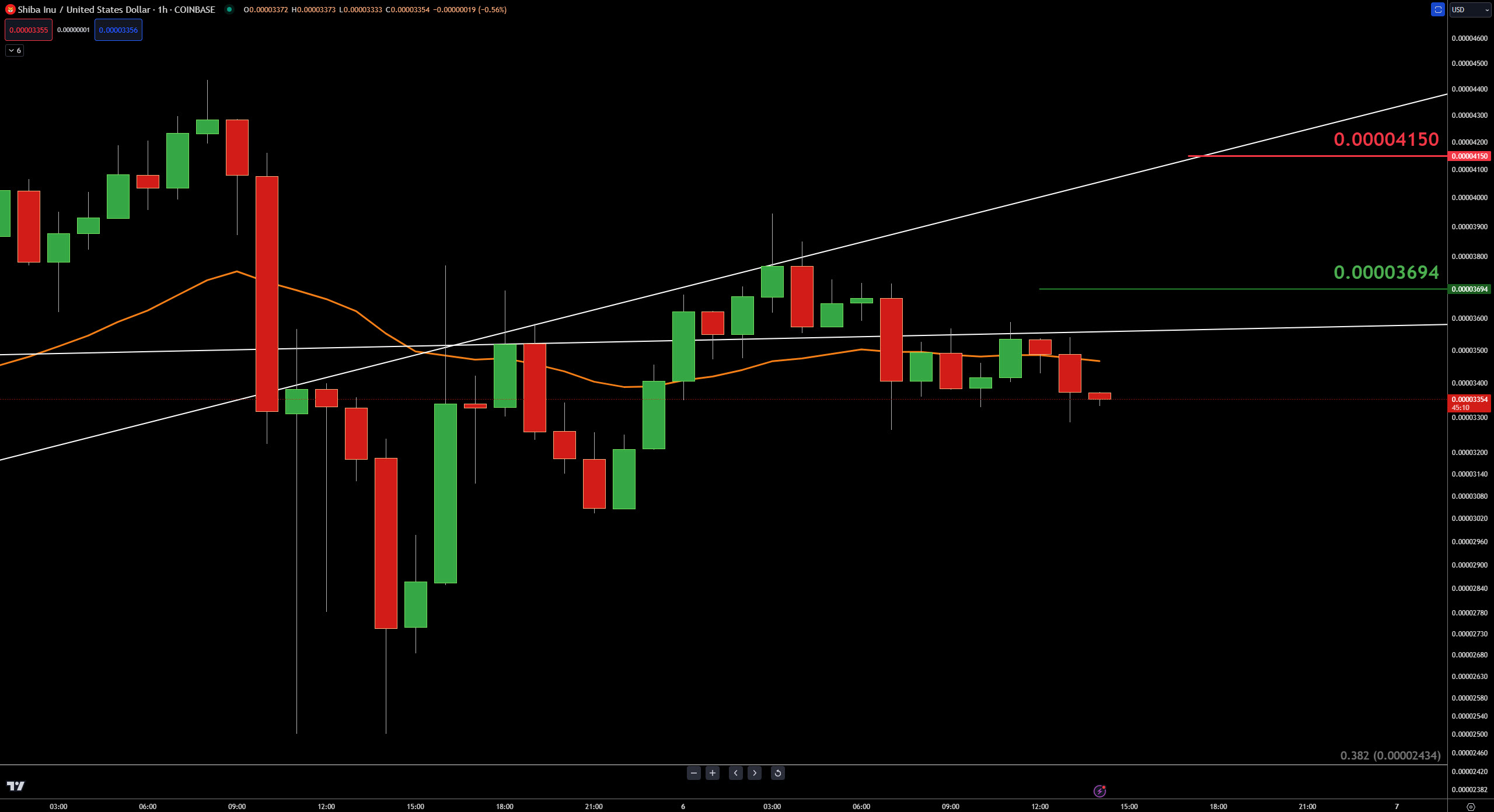
Alright, some of you fine degen folks have e-mailed and messaged asking for a ‘faster’ time frame for $SHIB. Here’s the problem(s) with that:

  1. This newsletter goes out around 1700-ish EST. 
  2. By the time you read this, anything faster than a daily might be totally irrelevant. 
  3. People in the $SHIB, $DOGE, $PEPE, $BONK, and $FLOKI crowd are scary. 

So, just be aware that the hourly chart you’re looking at was done around 1400 EST. The closest white trendline near $0.00003550 is the first resistance zone bulls need to get above, followed by a close above the 0700 EST candlestick’s open. 

Upside potential might be limited to the next trendline, around $0.00004150. Any move to or below $0.00003130 and this idea is scratched. 

More in   Crypto

View All

One Way To Use Stocktwits’ Social Data Tools

Have you ever heard the phrase ‘volume precedes price’? It’s an old-school technical analysis 101 maxim. For example, if an instrument is in a downtrend but then you start to see volume tick up, the theory is that price will follow the volume. 🧑‍🎓

It’s what technical analysts call a leading indicator—a heads-up or a warning that the probability of change is high and that it might happen soon. Analysts and traders might apply that principle (volume precedes price) to the Stocktwits Social Data. 

Read It

BlackRock’s Bitcoin ETF Surpasses Silver Trusts with $10 Billion in Assets

When the first gold ETF came out, it took a couple of years to reach $10 billion in AuM (assets under management). How long did it take Blackrock’s $IBIT? 2 months. 😱

Bitcoin spot ETFs have now eclipsed the largest silver trusts regarding assets under management (AuM), setting their sights on surpassing gold trusts next. According to recent data from HODL15Capital, BlackRock’s IBIT has achieved an impressive milestone, amassing an AuM of $10.03 billion, translating to a remarkable year-to-date (YTD) increase of 35.2%.

Read It

Seriously, SHIB People, Are You Ok?

Look at the 1-minute chart below from yesterday’s intraday price action on $SHIB. 🤯

It was one of the craziest swings of all the major market cap memecoins by far, just an insane move. And how did the Stocktwits SHIB stream react? Like you’d expect any high class degen to react: Unf*cking fazed.

Read It

Technically Speaking – March 5, 2024

Well, like I said, this isn’t a fun Litepaper. Instead of finding wen-Moon or wen-Lambo, we will be looking for wen-bottom. 💔

I’ll keep it short and sweet, quickly identifying where analysts and traders see strong support levels ahead.

Read It