Welcome to the Stocktwits Crypto Data Dive for Week 46 of 2023! 📊
In this issue, we’ll dive into the data to keep you informed about the progress of the overall crypto market and shine a spotlight on emerging and established trends.
The Stocktwits Crypto Data Dive has three main objectives:
- Tracking the weekly total market cap of the crypto market.
- Highlighting the 25 best-performing cryptocurrencies of the week.
- Monitoring the top 10 cryptocurrencies within various high-performing indices, including “Proof of Work,” “Web 3,” “Smart Contracts,” and more!
We track the performance of these indices from Thursday to Thursday to ensure a more accurate representation and account for weekend volatility.
So, without further delay, let’s jump right into the data from week 46 and explore its intriguing insights! 🚀
Total Market Cap
Total Market Cap Update
What is the broader trend within the crypto market? The simplest way to track that is using a total market capitalization chart. So let’s see what we’ve got. 🔭
From the highest all-time market cap close of $2.834 trillion, crypto is down -53.36%.
The cryptocurrency market is up +78.22% YTD and +91.25% YoY.
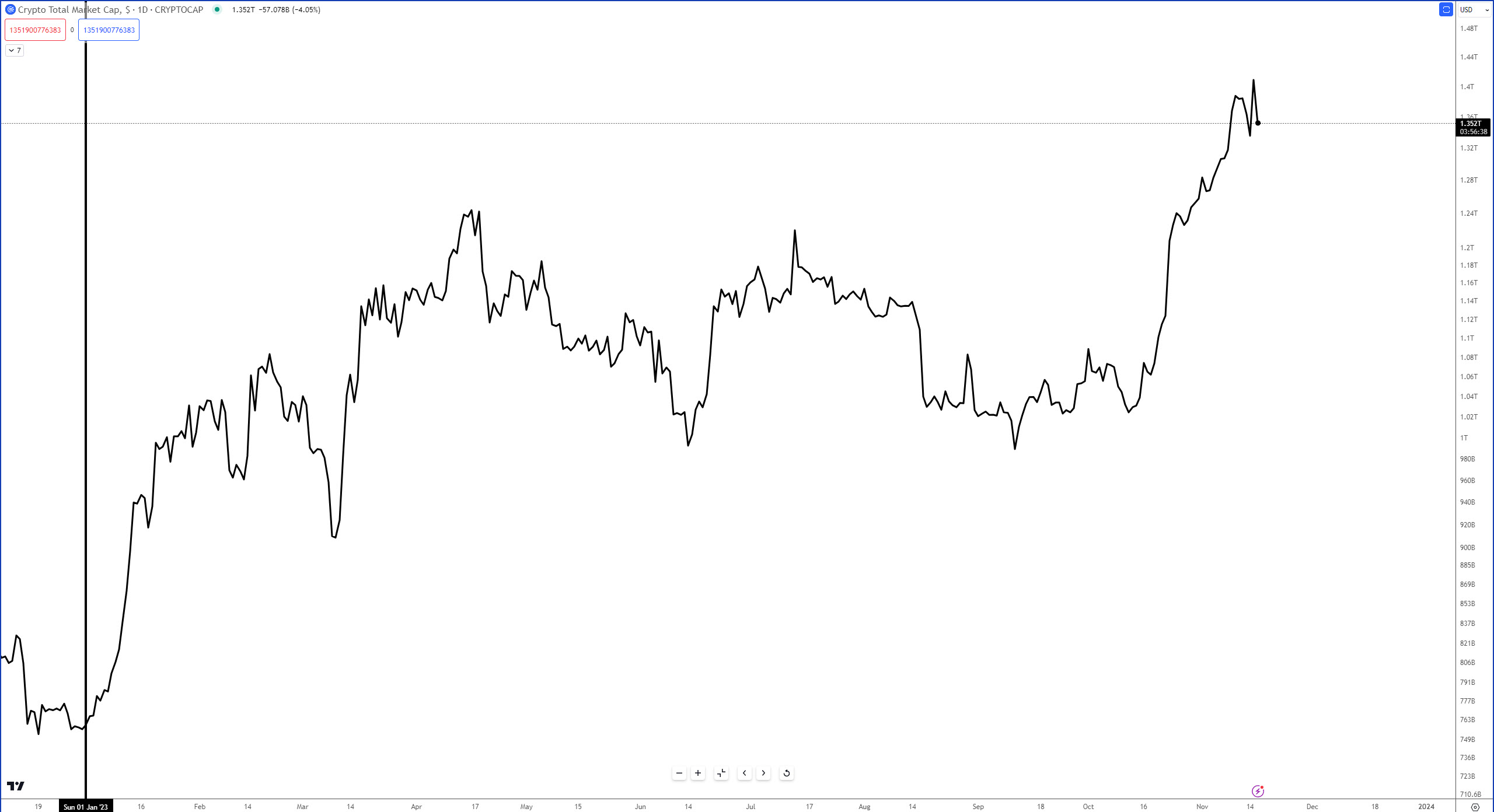
*the price levels and performance vals may be very different from what you read in your mailbox vs. what’s happening in the live market. This is especially true when crypto faces a new bull or bear run.
Top 25 Cryptocurrencies
Top 25 Cryptocurrency Update
Overall, the Top 25 cryptocurrencies were lower for the week by -0.5% versus +8.2% prior.
*The universe used to construct the Top 25 list consists of all cryptocurrencies with at least $1 billion in market cap, excluding stablecoins.

Stocktwits Crypto Index RRG
Stocktwits Crypto Index RRG
Relative Rotation Graphs (RRG) help us visualize how a currency or sector performs compared to a benchmark – in this case, the U.S. Dollar Index (DXY). Think of the four colored sectors as stages in a race:
- Leading Quadrant (green) – You’re a champ! 🏆 You’re ahead of everyone else, and the crowd is cheering. But watch out; you might be overdoing it.
- Weakening Quadrant (yellow) – You’re slowing down 😓 and losing your lead. Maybe you’re a bit demoralized because your biggest fan didn’t show up. You’re now in the middle of the pack.
- Lagging Quadrant (red) – Disaster strikes! 😱 You’re injured, exhausted, or just made a big mistake. You’re now in last place, and it’s a sad scene.
- Improving Quadrant (blue) – Time for a comeback! 💪 Your motivation returns, the music swells, and you’re picking up speed. You’re back in the middle, catching up with the leaders.
Analyzing the RRG Examples
Example 1: Rapid Rotation
– If an instrument moves quickly through all four quadrants, it could indicate high volatility or erratic behavior. Traders may want to be cautious or use appropriate risk management strategies in such cases.
Example 2: Stuck in the Middle
– An instrument that remains close to the center of the RRG might be in a consolidation phase, lacking a clear trend or momentum. Traders might wait for a decisive move before entering a position.
Example 3: Consistent Leader
– If an instrument stays in the Leading Quadrant (top right) for an extended period, it could signify a strong, sustained uptrend. Traders might consider buying opportunities or riding the trend.
Example 4: Slow Recovery
– An instrument that gradually moves from the Lagging Quadrant (bottom left) to the Improving Quadrant (blue) and eventually to the Leading Quadrant (green) could indicate a slow but steady recovery. Traders might look for potential reversal or bottom-fishing opportunities.
The GIF below shows the past 10 days of movement on the RRG.

The GIF below shows the past 13 weeks of movement on the RRG.

Proof-Of-Stake
Proof-Of-Stake Index
The Proof-of-Stake Index includes any cryptocurrency that has a Proof-of-Stake consensus mechanism.
We construct this index by limiting the assets in this space to a minimum market cap of $100 million.

Current week’s performance: +23.4%
Last week’s performance: +13.62%
DEX
2. Decentralized Exchange Index (DEX)
The DEX Index (Decentralized Exchange) comprises the cryptocurrencies and tokens that make up the DEX space.
We construct this index by limiting the assets in this space to a minimum market cap of $100 million.

Current week’s performance: +21.48%
Last week’s performance: +12.4%
DeFi
3. Decentralized Finance (DeFi)
The DeFi Index (Decentralized Exchange) comprises the cryptocurrencies and tokens that make up the DeFi space. Cryptocurrencies such as Curve Finance, yearn.finance, and Clover are examples of assets that make up this index.
It’s not uncommon to see cryptos from the DEX Index and also in the DeFi Index.
We construct this index by limiting the assets in this space to a minimum market cap of $200 million.

Current week’s performance: +16.1%
Last week’s performance: +10.1%
Biggest Loser - Lending
Lending Index
The Lending Index comprises cryptocurrencies and platforms where users can offer their cryptocurrency for liquidity or loans for a return.
We construct this index by limiting the assets in this space to a minimum market cap of $50 million.

Current week’s performance: -1.3%
Last week’s performance: +10.7%
Summary
Putting It All Together
The Kumo Twist we’ve been looking at for several months is currently in play. It’s not uncommon to see a market create a local high/low two to three periods before or after the Twist.
Total Market Cap Week 44
Week 44 showed a confirmed Ideal Bullish Ichimoku Breakout on the weekly chart.

Week 44’s Crypto Data Dive also pointed out the extremes in the weekly RSI and Composite Index.

Total Market Cap Week 45
And here’s what we looked at last week:

The Kumo Twist is still a concern for bulls; the further the gaps between the bodies of the candlesticks and the Tenkan-Sen, the greater the probability of a pullback.
The next major resistance point ahead is when the Chikou Span hits the top of the Cloud, Senkou Span B, which sits at $1.725 T for the next two weeks and then drops to $1.61 in the first weekend of December.
From the weekly RSI and Composite Index perspective, the CI is still against historical resistance, but the RSI has achieved a major milestone.

The weekly RSI has broken above the last overbought level in a bear market (65). If RSI closes at or above 70, then many analysts may consider it a shift from a bear to a bull market.
Total Market Cap Week 46
And here is what the weekly Total Market Cap chart looks like now:

There are some warning signs that the drive higher here may run out of steam and pause. The first warning sign is the gaps between the bodies of the candlesticks and the Tenkan-Sen.
The second warning sign is the extreme high in the Composite Index, which is at a two-year high.
While bulls may not be happy with an incoming pause or pullback, this weekly chart isn’t all bad. Because the RSI moved above 70, it’s converted into bull market conditions.
Because this expansion phase is very new, historical performance suggests that a deep pullback isn’t the most likely move. Instead, a consolidation period has a high probability of occurring.
In the event of a pullback, near-term support is the Tenkan-Sen at $1.22 T.
See You Next Saturday!
