If you don’t want to read all the nerd speak here, zip down the TL;DR (Too Long;Didn’t Read) section at the end for a quick synopsis.
A look at August 2022 for Bitcoin

When you look at Bitcoin’s ($BTC.X) monthly candlestick chart, you’ll see that August’s candlestick is nearly identical to July’s candlestick. The bodies of both candlesticks are relatively the same size. There are some bullish and bearish interpretations to look at from a candlestick perspective.
For bears, Bitcoin nearly created a bearish engulfing candlestick on the monthly chart. July’s open was $19,960, while August’s close was $20,053. Less than a $100 move kept August from close below July’s open.
The result of August’s close doesn’t really shout imminent bull run – it really just shows consolidation and indecision. Because the short-term trend has been bearish, any consolidation after a strong down move can be interpreted as a small pause before moving lower again.
However, bulls might see things a little differently.
For bulls, the August close could be interpreted as a victory – albeit a pyrrhic one – because of the denial of a close below July’s ope. Additionally, August’s monthly candlestick has a higher high and a higher low than July’s – often interpreted by analysts as bullish.
What bulls don’t want to see is a new low that would pierce Augusts or July’s lows – but that might be unavoidable.
But what about September?
September 2022 for Bitcoin is often ‘meh’
For Bitcoin and the broader cryptocurrency market, September is often viewed with foreboding. This is especially true when you consider that for the past five years, September has been a red month.

2021 -7.04%
2020 -7.53%
2019 -13.51%
2018 -6.42%
2017 -8.52%
What does September look like going back all the way to the beginning of Bitcoin’s price history? Let’s see:
2016 +6.25%
2015 +2.22%
2014 -12.97%
2013 +0.64%
2012 +12.18%
2011 -37.31%
2010 +3.17%
Is there anything we can glean from this data? Not much. A little over a decade worth of data is not much data at all. That might sound weird if Bitcoin is the first instrument that got you exposed to financial markets, but it’s the truth.
But let’s look at two key oscillators on the monthly chart: The Relative Strength Index (RSI) and the Composite Index. Both are considered momentum indicators/oscillators. Basically, their purpose is to give a heads up to analysts by saying, ‘hey, dood, this stonk is crazy fire yo, but it’s looking kinda overbought’ or ‘zomg bra, the bottom is close, dis is about to mooooon, let’s gooooooo’.
Real quick: you might be familiar with the RSI, and you might be familiar with the Composite Index if you’ve been reading the Litepaper since June. But if you’re not, here’s a quick rundown on the Composite Index.
The Composite Index was invented by Connie Brown, she created the Composite Index to essentially update J. Welles Wilder’s RSI. She added a momentum calculation to the RSI. The RSI is bounded (only records values between 0 and 100), while the Composite Index is unbounded (records values below 0 and above 100).
Basically, the Composite Index will catch divergences and moves that the RSI cannot.
Let’s look at the RSI first – we’re still on the monthly Bitcoin chart.
My oh my, look at that RSI

I want to call your attention to the two green horizontal lines on the monthly RSI – one is at 40 and another at 50. They represent the RSI’s first and second oversold levels when an instrument is in a bull market.
For those of you who still believe 70 is overbought and 30 is oversold – you’re probably going, ‘EHRMEGURD, THAT’S NOT RIGHT, NOOB.’
Another amazing thing that Connie Brown developed was an update for the RSI regarding the default overbought and oversold levels. Wilder created the RSI at a time when stocks were going sideways for a looooooong ass time. The RSI is fantastic in range-bound markets – but it is the suck in trending markets.
Connie fixed that for us. Now, I can’t go through all the details in this Litepaper – but I will throw the values in here so you can reference them later. Check out Connie Brown’s book Technical Analysis for the Trading Professional if you want to know more – it’s an absolutely phenomenal piece of work.
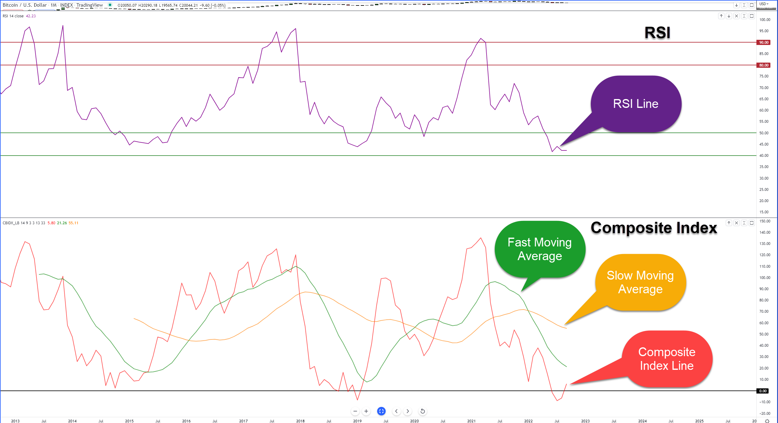
When an instrument is in a bull market, overbought is 80 and 90, and oversold is 50 and 40.
When an instrument is in a bear market, overbought is 55 and 65, and oversold is 30 and 20.
Believe it or not, depending on the data and exchange you use, the all-time low for Bitcoin’s monthly RSI was found in June 2022 (otherwise, January 2019, but they’re almost exactly the same level), and it hasn’t deviated much from that low – which is just above the final oversold level in a bull market (40). Is that enough to say: “LET’S GOOOOO MOOOOOOON”? No – but maybe the next little bit is.
Hidden Bullish Divergence.
Lemme say it again.
Hidden Bullish Divergence.
Hidden bullish divergence occurs when price makes higher lows, but the oscillator makes lower lows. It’s ONLY valid when an instrument is in an uptrend. Is Bitcoin in an uptrend on the monthly chart? Yes. It might not seem like that since May 2021 and into this year, but the overall trend is up.
So why is this a big deal? Because when hidden bullish divergence shows up while the RSI is against an oversold level, there is a stupidly high probability of the dominant trend resuming. This is especially true on the monthly chart.
Also, the RSI developed a Falling Wedge pattern into the final support level at 40. There are many reasons why the bulls are probably giddy with excitement.
But don’t get too carried away here, bulls. It’s important to point out that Bitcoin has been on an absolute tear since its inception and, from the monthly chart perspective, has a lot of room to retrace a ginormous amount of price action.
The RSI is parked right up against its final oversold level in a bull market. The bulls haven’t exactly come in to save Bitcoin. Hell, there are plenty of reasons why bulls, from a technical analysis perspective, should be insanely happy and positive about the immediate future.
Except, so far, they’re not. The RSI hasn’t really moved away from the historical all-time lows. Unless the bulls come in to support Bitcoin down here, the bears will likely keep their grip on this market.
That does it with the RSI – what does the Composite Index show?
RSI 2.0 – The Composite Index
Still here? Great. Because we’re still on the monthly Bitcoin chart.
Like the RSI, the Composites Index hit new all-time lows, but the Composite Index hit those lows in July (versus June for the RSI). There are now three instances on the monthly chart where the Composite Index has traded near the zero line.
The first was between July to October 2014. The second was between May 2018 and January 2019. And the third instance started in May 2022 and is still going.
Along with the proximity to the zero line, the number of times the zero lines have been crossed below zero has only happened twice. The first time in January 2019 and the second time in July 2022.
In the prior two instances where the Composite Index has traded at or near the zero line, massive rallies have occurred. Again, though, that’s only two pieces of recent data to go off of – don’t read too much into it. But we could look at a market with which Bitcoin is heavily correlated, like the NASDAQ, for some historical perspective.
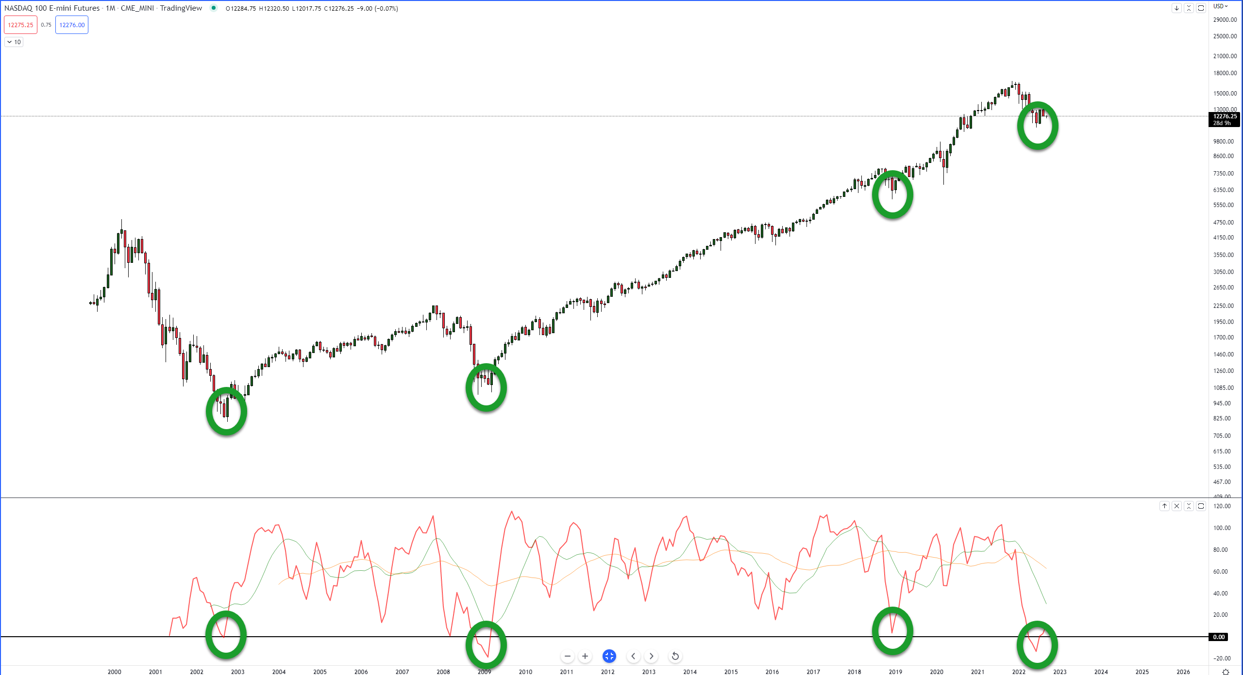
The NQ (E-mini NASDAQ Futures) monthly chart shows the Composite Index has only reached a range near or below the zero line five times since June 1999.
- September 2002
- March 2008
- November 2008 – March 2009 (below zero)
- December 2018
- April 2022 – July 2022 (below zero)
Interesting to note here that there was a gap of ten years between the third and fourth instance. Also interesting is the most recent major low in June 2022 is just a hair above the all-time low in February 2009.
The chart above shows a critical bullish consideration to be aware of on the monthly chart: hidden bullish divergence. The hidden bullish divergence is interpreted the same way as it is on the RSI.
Ichimoku, Too
We will end this long-term analysis of Bitcoin with the Ichimoku Kinko Hyo system. From a monthly chart perspective, in the Ichimoku system, Bitcoin remains in a clear bull market (price is above the Cloud). However, it is below the Tenkan-Sen (blue) and the Kijun-Sen (red).
The most powerful support zone on the monthly chart fo Bitcoin is, not surprisingly, the $10,000 value area. Not only is $10,000 a ‘no duh big red truck’ price level of importance, but it contains two of the most powerful support levels on the chart: the Volume Point of Control (from the 2019 low to today) and the top of the Ichimoku Cloud (Senkou Span B).
We know that Senkou Span B is the strongest and most difficult level to close above or below within the Ichimoku system. Additionally, if Senkou Span B spends a significant amount of time in a flat condition, that strength is exacerbated.

How long has the monthly Senkou Span B been flat? 35 months. That’s 152 weeks or 1065ish days. Almost 3 years.
Another major piece of data to notice is the two horizontal lines. Between December 2022 and January 2023 is the next monthly Kumo Twists. Kumo Twists have a high probability of becoming turning points for markets if a market is trading strongly in a single direction.
TL;DR – Putting It All Together
From the perspective of the monthly oscillators, there’s a strong case and a high probability for Bitcoin to find a bottom soon and begin another leg higher.
From the perspective of the Ichimoku Kinko Hyo system, the near-term outlook remains messy. While Bitcoin remains in a technical bull market, the current price action is smack dab in between resistance above (the Tenkan-Sen and Kijun-Sen, $33,000 and $39,000, respectively) and support below (Senkou Span B and the VPOC at $10,000).
And remember this: If we were looking at the monthly chart for Bitcoin like we would an hourly, daily, or weekly chart, would we assume that the first breakout above such a critical level as $10,000 wouldn’t face a retest? Not likely. It doesn’t have to happen, but it’s very probable it still will happen.
Here’s where it gets contentious. The path of least resistance, at the present traded price in the $20,000 level, is lower.
Long-term bulls who want to get in at a bigger discount may look forward to Bitcoin continuing its trend lower, pushing towards the $10,000 at or around the time of the Kumo Twist between December 2022 and January 2023, creating very clear conditions for a probable bottom before the next ‘big rally.’
Short-term bulls, who are tired of the current downtrend, could see some relief in the form of a rally that pushes Bitcoin towards the $40,000 value area but could likely reverse if it is trading near $40,000 around the time of the Kumo Twist between December 2022 and January 2023.
In either scenario, 2023 will be critical for Bitcoin within the Ichimoku system. Because in order for Bitcoin to maintain a clear and strong bullish trend, it will need to remain above the monthly Cloud.
The bottom of the monthly Cloud for 2023 starts at $10,000 and then moves dramatically higher until it reaches $33,000 in June 2023 before slowly increasing towards the $34,400 level in December 2023.
This will be fun to watch.