Welcome to the Stocktwits Crypto Data Dive for Week 22 of 2023! 📊
In this issue, we’ll dive into the data to keep you informed about the progress of the overall crypto market and shine a spotlight on emerging and established trends.
The Stocktwits Crypto Data Dive has three main objectives:
- Tracking the weekly total market cap of the crypto market.
- Highlighting the 25 best-performing cryptocurrencies of the week.
- Monitoring the top 10 cryptocurrencies within various high-performing indices, including “Proof of Work,” “Web 3,” “Smart Contracts,” and more!
We track the performance of these indices from Thursday to Thursday to ensure a more accurate representation and account for weekend volatility.
So, without any further delay, let’s jump right into the data from week 21 and explore the intriguing insights it offers! 🚀
Total Market Cap
Total Market Cap Update
What is the broader trend within the crypto market? The simplest way to track that is using a total market capitalization chart. So let’s see what we’ve got. 🔭
From the highest all-time market cap close of $2.834 trillion, crypto is down -62.16%, versus -62.22% from last week.

YTD, the cryptocurrency market is up +43.39%.
*the price levels and performance values may be very different from what you read in your mailbox vs. what’s happening in the live market. This is especially true when crypto faces a new bull or bear run.
Top 25 Cryptocurrencies
Top 25 Cryptocurrency Update
There were 3 changes in the Top 25 this week.

Overall, the Top 25 cryptocurrencies were higher for the week by +2.3% versus -1.2% prior. 👍
*The universe used to construct the Top 25 list consists of all cryptocurrencies with at least $1 billion in market cap, excluding stablecoins.
Stocktwits Crypto Index RRG
Stocktwits Crypto Index RRG
Relative Rotation Graphs (RRG) help us visualize how a currency or sector performs compared to a benchmark – in this case, the U.S. Dollar Index (DXY). Think of the four colored sectors as stages in a race:
- Leading Quadrant (green) – You’re a champ! 🏆 You’re ahead of everyone else, and the crowd is cheering. But watch out; you might be overdoing it.
- Weakening Quadrant (yellow) – You’re slowing down 😓 and losing your lead. Maybe you’re a bit demoralized because your biggest fan didn’t show up. You’re now in the middle of the pack.
- Lagging Quadrant (red) – Disaster strikes! 😱 You’re injured, exhausted, or just made a big mistake. You’re now in last place, and it’s a sad scene.
- Improving Quadrant (blue) – Time for a comeback! 💪 Your motivation returns, the music swells, and you’re picking up speed. You’re back in the middle, catching up with the leaders.
Analyzing the RRG Examples
Example 1: Rapid Rotation
– If an instrument moves quickly through all four quadrants, it could indicate high volatility or erratic behavior. Traders may want to be cautious or use appropriate risk management strategies in such cases.
Example 2: Stuck in the Middle
– An instrument that remains close to the center of the RRG might be in a consolidation phase, lacking a clear trend or momentum. Traders might wait for a decisive move before entering a position.
Example 3: Consistent Leader
– If an instrument stays in the Leading Quadrant (top right) for an extended period, it could signify a strong, sustained uptrend. Traders might consider buying opportunities or riding the trend.
Example 4: Slow Recovery
– An instrument that gradually moves from the Lagging Quadrant (bottom left) to the Improving Quadrant (blue) and eventually to the Leading Quadrant (green) could indicate a slow but steady recovery. Traders might look for potential reversal or bottom-fishing opportunities.
The GIF below shows the past 10 days of movement on the RRG.
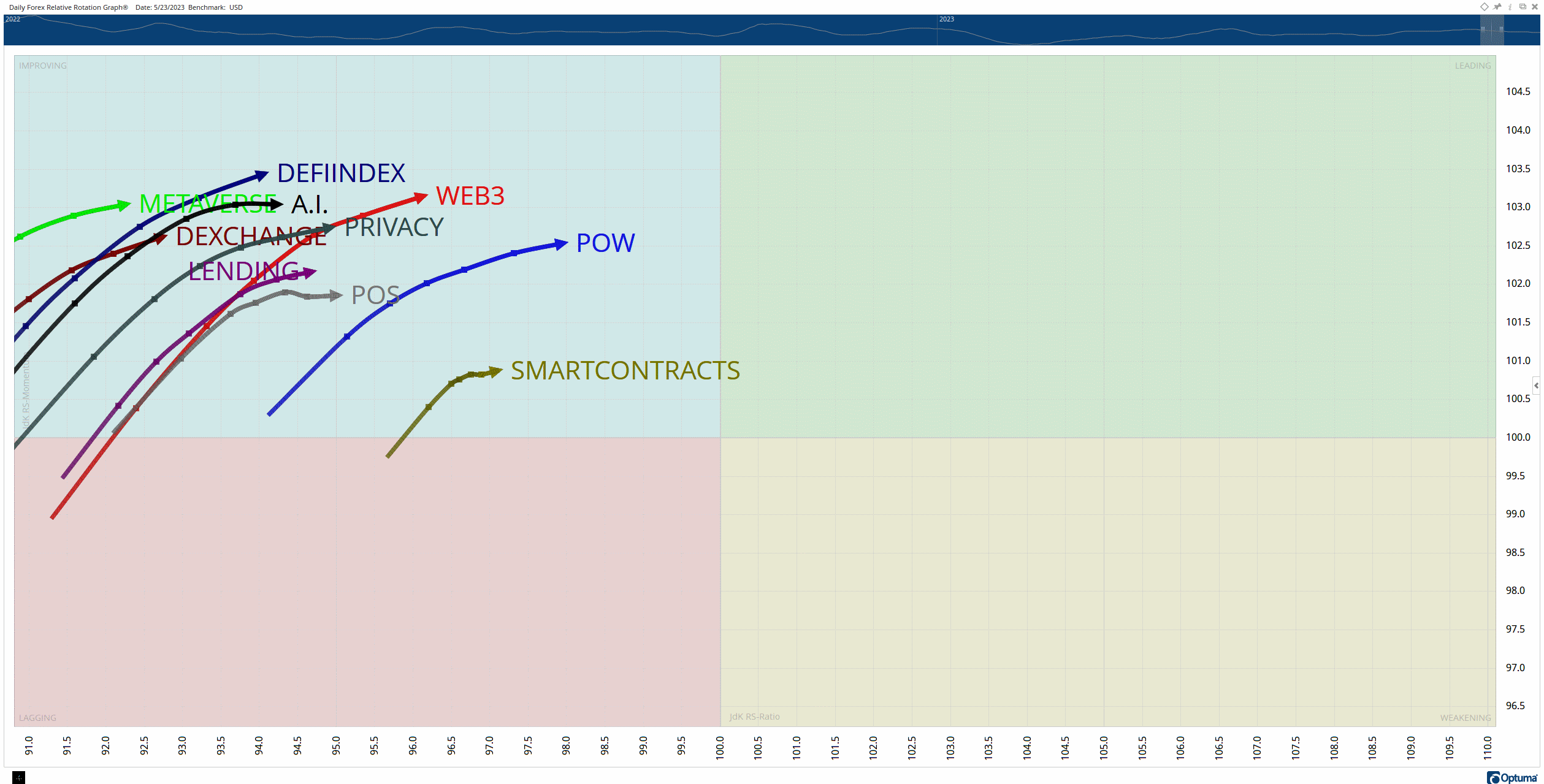
Momentum remains bullish but very choppy, it’s almost like the border between the Lagging and Improving quadrants acted like a support zone for some of the indices.
The GIF below shows the past 13 weeks of movement on the RRG.

Pretty much the same as last week: the weekly RRG still looks weak, but the momentum to the downside appears to have at least slowed down.
Metaverse
Metaverse Index
The Metaverse Index is a collection of cryptocurrencies that focuses on virtual worlds and environments, including the Play 2 Earn and gaming class of cryptocurrencies.
We construct this index by limiting the assets in this space to a minimum market cap of $10 million.

Current week’s performance: -6.7%
Last week’s performance: +7.4%
Web3
2. Web 3 Index
The Web3 Index comprises cryptocurrencies focusing on the next generation of the internet: blockchain, publicly distributed ledgers, transparency, openness, decentralization, and tokenonomics.
$LINK.X and $GNT.X are examples of assets in this category.
We construct this index by limiting the assets in this space to a minimum market cap of $50 million.

Current week’s performance: -1.5%
Last week’s performance: +6.5%
Smart Contracts
3. Smart Contracts Index
The Smart Contracts Index includes cryptocurrencies whose blockchains allow for smart contracts. Ethereum and Cardano would be examples of cryptocurrencies that fall into this index.
We construct this index by limiting the assets in this space to a minimum market cap of $250 million.

Current week’s performance: +2.2%
Last week’s performance: -0.5%
Biggest Loser - Privacy Coins/Tokens
Privacy Coins/Tokens Index
Privacy coins/tokens are cryptocurrencies that either focus on creating complete anonymity with transactions or offer anonymity as an option when performing transactions.
We construct this index by limiting the assets in this space to a minimum market cap of $10 million.

Current week’s performance: -1.5%
Last week’s performance: -3.2%
Summary
Putting It All Together
Structurally, nothing has changed from last week: price is still stuck inside the Falling Wedge.
However, price did attempt a breakout before returning inside – analysts often interpret that as a bearish event, but the bears have been unable or unwilling to capitalize on that event.
I’ll keep the falling wedge patterns ‘definition’ here until there is a clear breakout from that pattern.
As per Bulkowski’s analysis, the falling wedge pattern in a bullish market exhibits the following characteristics:
- Typically, there are at least five instances where the price touches one of the trendlines, with the other three being touched multiple times.
- The falling wedge pattern tends to persist for a minimum of three weeks.
- Volume generally declines until the breakout occurs.
- Approximately half of the falling wedges serve as consolidations of the preceding trend.
- Breakouts above a falling wedge in a bull market tend to have the lowest failure rates.
- The most robust breakouts tend to happen between 55% and 80% of the way toward the pattern’s apex.
- Around 29% of falling wedges experience false breakouts to the downside, resulting in a bear trap followed by a strong rally.
While these statistics provide valuable insights, it is important to note that Bulkowski’s analysis primarily focuses on the stock market. How his statistics stack against the crypto market is unknown.
See You Next Saturday!
