Every now and again, in the world of market-capitalization-weighted indexes, an argument breaks out about how much weight the largest stocks should be pulling. And we’re definitely experiencing one of those instances now… 👀
If you’re reading any technical analysts’ work these days, you’ll notice a big theme is market breadth. At its core, it studies the underlying components driving a stock market index.
The theory goes that in a healthy bull market, we’d like to see a lot of stocks participating to the upside. And in a healthy bear market, we’d like to see a lot of stocks participating to the downside. Essentially, we want all the players pulling their weight. 🏋️
So where are we in the current environment?
The S&P 500 ETF ($SPY) is up 8.34% as of today’s close, so here are some interesting stats about its “breadth.”
- 279 stocks are contributing positively, and 225 are negatively contributing.
- For those that are positive, the median contribution is 0.86 basis points and -0.69 basis points for negative ones.*
- The median return for positive stocks is 10.09% and -8.59% for negative stocks.
- The top 5 contributors (Apple, Microsoft, Nvidia, Meta, and Amazon) add ~617 basis points to the index.
- The remaining 499 stocks (yes, 504 total) add just ~231 basis points to the index.
So what this tells us is that just five stocks account for about 75% of the stock market’s returns this year. And if we expand that to the top 10, it jumps to about 86%. 😮
Bears will look at these stats and say that the market is bound to fall if/when these five or ten stocks stop going up. Bulls will look at this and ask how the market could go down when its best players are acting so strongly. ⚔️
Both could be right, depending on the timeframe they’re referring to. But ultimately, it remains just one of many factors impacting the market’s price and sentiment.
Right now, all we know is that a few key players are scoring most of the points. They’ve got the team on their back and will need to rest eventually. However, how this resolves itself ultimately remains to be seen. What is for sure, though, is that people have extreme opinions about this topic. 😠
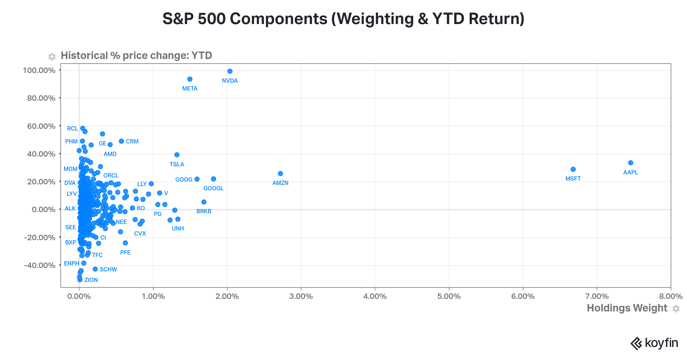
Nonetheless, time will tell. Check out this chart for some additional perspective on the stats above. It plots all the S&P 500’s components by their weighting in the index and their year-to-date return. As we can see, the biggest stocks in the index have had some of the strongest returns year-to-date. That’s why we are where we are. 🤷
*Contribution is expressed in basis points and calculated by multiplying the stock’s weighting in the index and its year-to-date percentage return.